Most virtual career fairs struggle with the same problem. They try to organize information, but forget to organize movement.
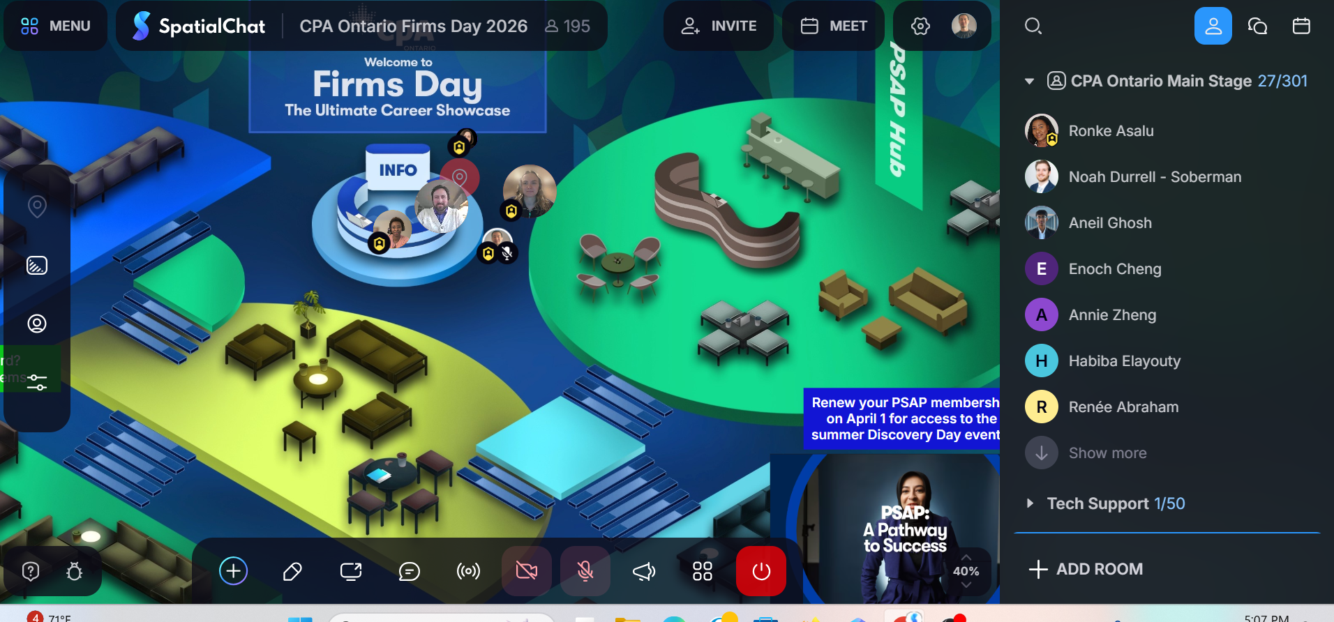
CPA Ontario’s Firms Day didn’t feel intuitive because it had better instructions. It worked because the SpatialChat space itself reduced the need for them. From the moment attendees entered, the layout did what a good physical venue does — it gave people just enough context to start moving.
There was a visible center point, but it didn’t trap attention. Around it, smaller pockets suggested different ways to engage. Some areas invited casual conversation, others felt more purposeful. Without reading anything, you could tell where to pause, where to explore, and where to move on.
That’s a small shift, but it changes behavior immediately. When people don’t have to think about how to participate, they start participating faster.
Booths That Guide Conversations Instead of Waiting for Them
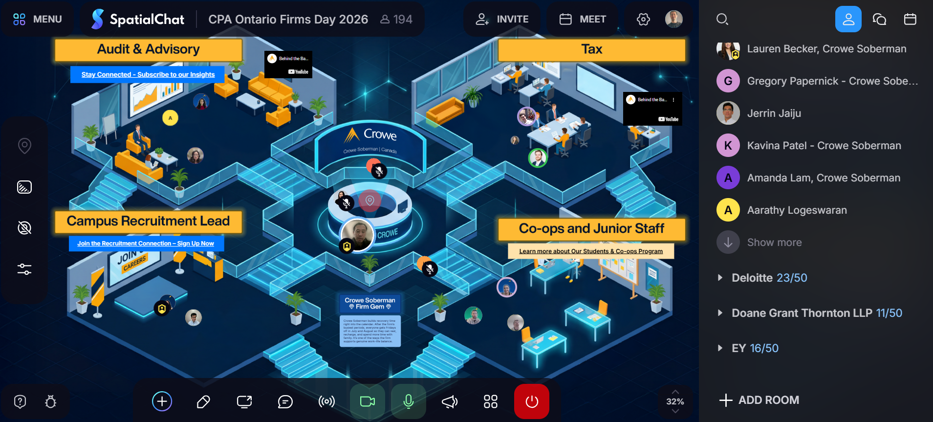
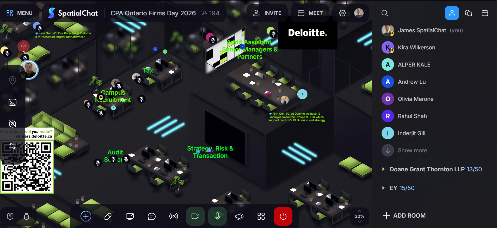
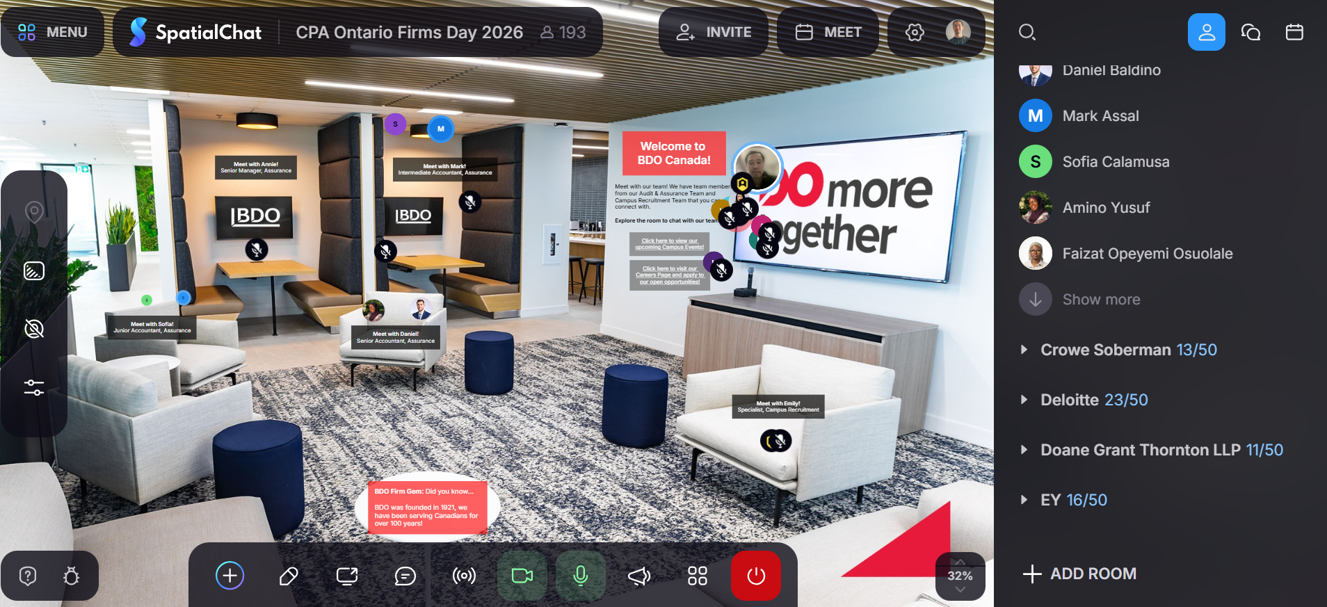
Inside the firm spaces, the difference became more obvious.
Instead of treating booths as single interaction points, many firms broke their spaces into smaller, clearly defined areas. Audit, tax, campus recruitment, and co-op conversations were separated in a way that felt natural rather than forced. This avoided a common issue in virtual events where everything happens in one place and conversations overlap or stall. Here, the layout did the filtering. If you were interested in a specific path, you moved toward that part of the space. If not, you kept going.
It sounds simple, but it removes hesitation. People don’t have to interrupt or guess where they belong. They just position themselves, and conversations follow. That’s where SpatialChat quietly stands out. It allows structure to come from layout, not from menus or moderation.
Familiar Spaces Make Interaction Feel Natural
Some environments leaned into a more realistic look: lounge areas, meeting corners, reception-style setups. They didn’t try to recreate an office perfectly, but they didn’t need to. The visual cues were enough.
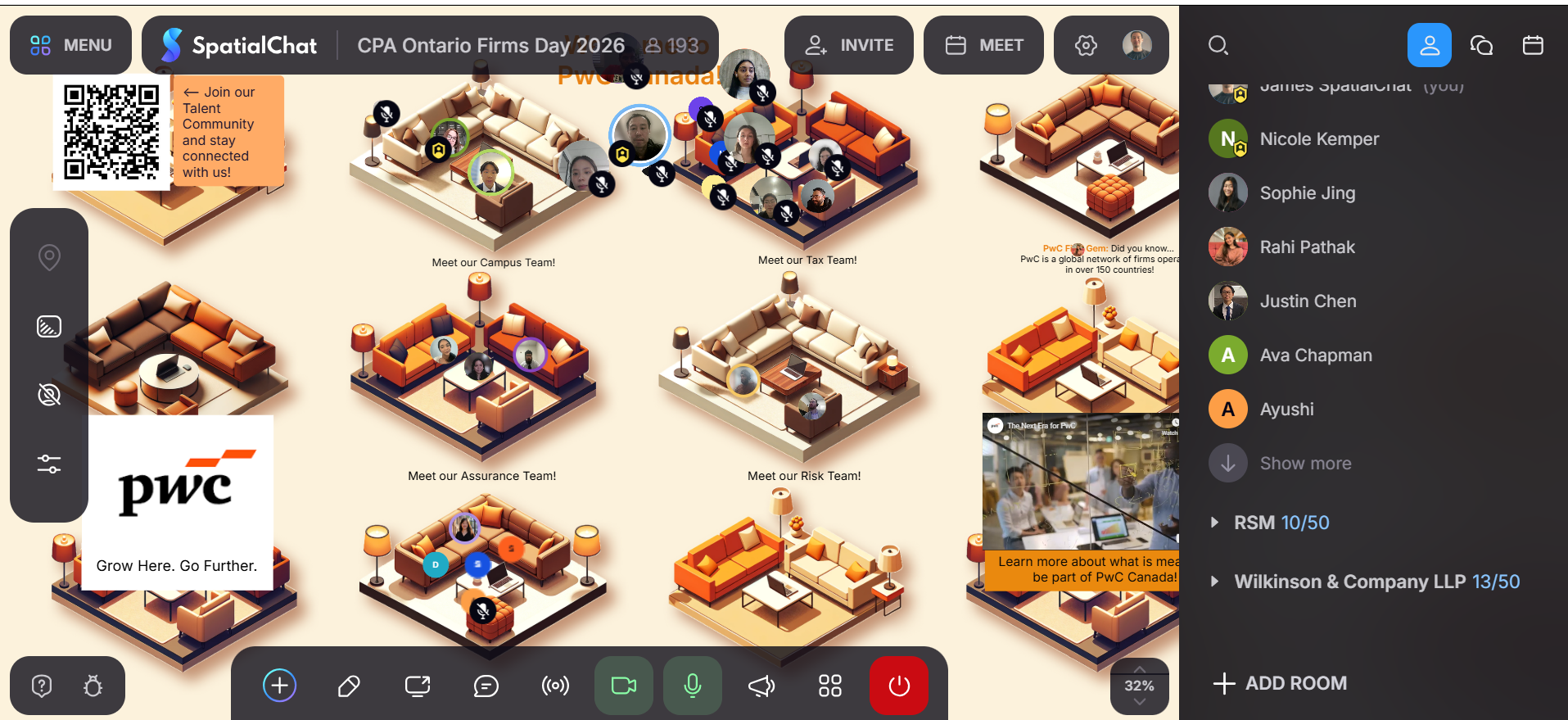
A cluster of chairs suggested a place to talk. A table implied a smaller group. Open areas encouraged movement. None of this required explanation, because people already understand these patterns from real life.
That familiarity matters more than visual polish. It lowers the effort needed to engage, which is exactly what virtual environments often get wrong.
High Attendance Only Works When People Can Spread Out
With close to 200 participants active at peak times, the event could have easily felt crowded. But it didn’t.
People naturally distributed themselves across the space. Conversations formed in smaller groups and stayed contained. You could step into one discussion, leave it without disruption, and find another within seconds.
This is where spatial interaction makes a difference. Instead of managing conversations through controls, the platform lets distance do the work. Being close means you’re part of the conversation. Stepping away means you’re not.
There’s no friction in joining or leaving, and that keeps the overall environment fluid even when participation is high.
Exploration Drove Engagement More Than Features Did
CPA Ontario described the experience as gamified, but it didn’t rely on heavy mechanics to make that happen.
What kept people engaged was the sense that there was always something else to check out. Different firms had different layouts. Some spaces felt open, others more structured. Content appeared in context rather than being pushed upfront. That created a simple but effective loop. Move, discover, engage, repeat.
It’s a quieter form of engagement, but it tends to last longer because it’s self-directed.
A Space That Lets People Decide How to Participate
The most important shift wasn’t visual or technical. It was control.
Attendees weren’t pushed through a fixed path. They chose where to go, who to speak with, and how long to stay. The event had structure, but it didn’t feel restrictive. That balance is difficult to get right. Too much control, and people disengage. Too little, and the experience becomes chaotic. Here, the design held that middle ground.
And that’s what made the event feel less like a virtual session and more like something closer to a real career fair, where people could move at their own pace and engage on their own terms.

Why This Approach Works Beyond One Event
What CPA Ontario built here isn’t just a well-designed career fair. It’s a reminder that virtual events don’t fail because people dislike online formats; they fail when the environment makes participation feel like work.
When space is treated as an active part of the experience, not just a visual layer, everything else becomes easier. Navigation feels natural. Conversations start without friction. Engagement becomes something people opt into rather than something organizers have to push.
That’s the real takeaway. Not that this event looked good, but that it behaved the right way. And when a virtual space behaves like that, people don’t just attend—they stay, explore, and connect in ways that are much closer to how real-world interactions actually unfold.